Project:
Hub Network
Role: Design.
For this comprehensive rebrand project at We Are Royale, I developed a versatile visual system addressing Hub Network's multi-faceted programming strategy. The network identified three distinct content categories: family-oriented game shows, boys' action programming like Batman, and girls' content such as My Little Pony.
Rather than forcing these diverse content streams into a one-size-fits-all approach, I created three complementary visual languages that could function both independently and as an integrated system:
Family Programming: I developed a vibrant paper craft world using origami and geometric elements that evokes the tactile creativity of family activities. This dimensional approach creates an inviting, playful environment that frames game show content while maintaining sophisticated design sensibilities.
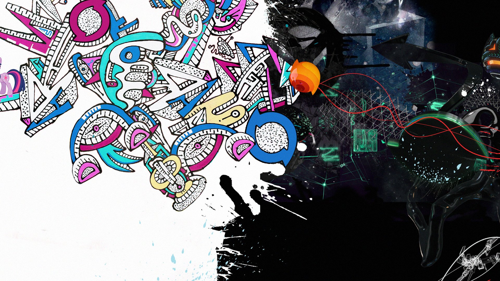
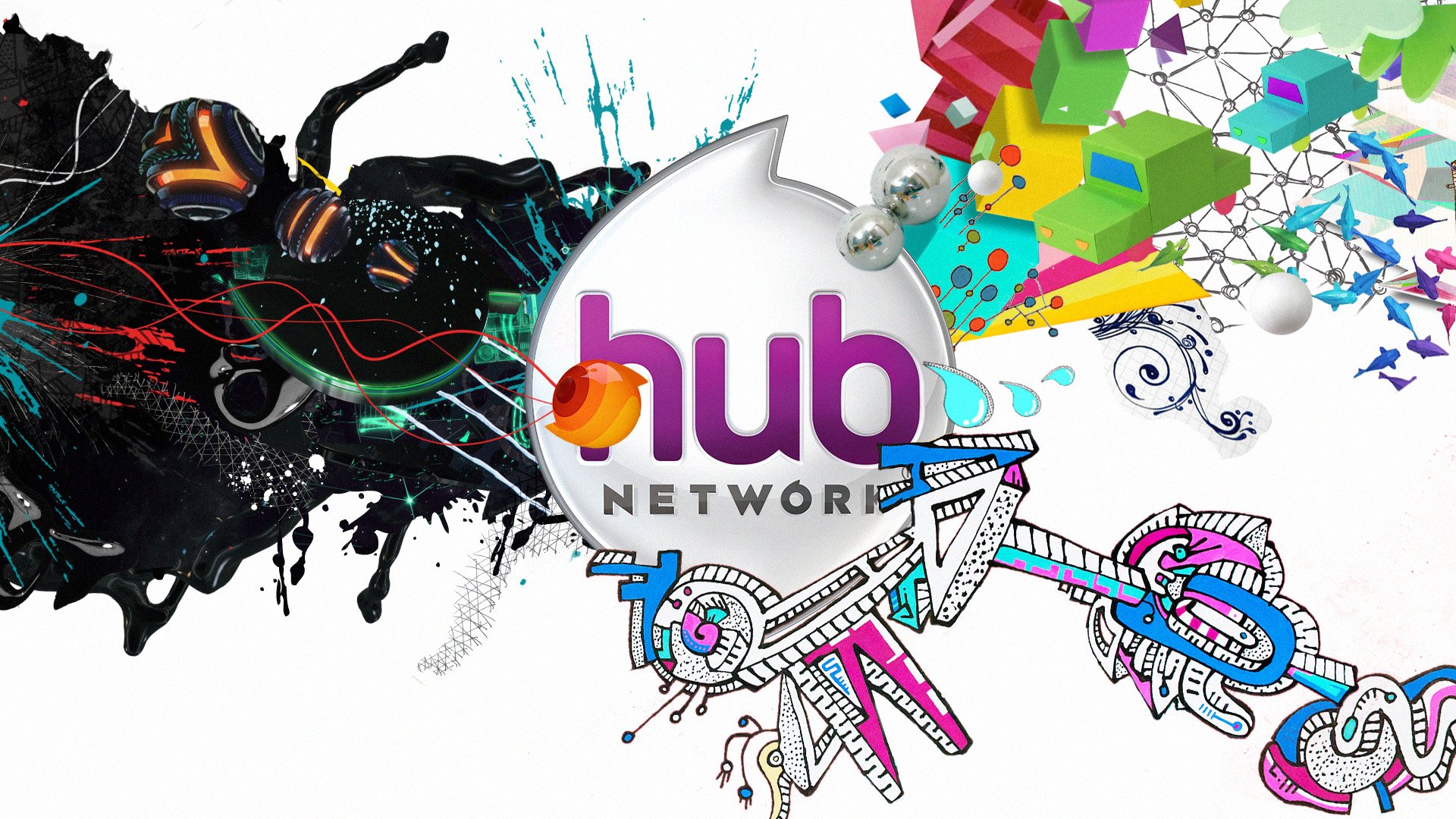
Boys' Programming: For action-oriented content, I designed a dark, tech-inspired aesthetic with strategic neon accents and dynamic graphic elements. This approach respects the maturity of shows like Batman Beyond while adding contemporary visual energy that appeals to younger viewers.
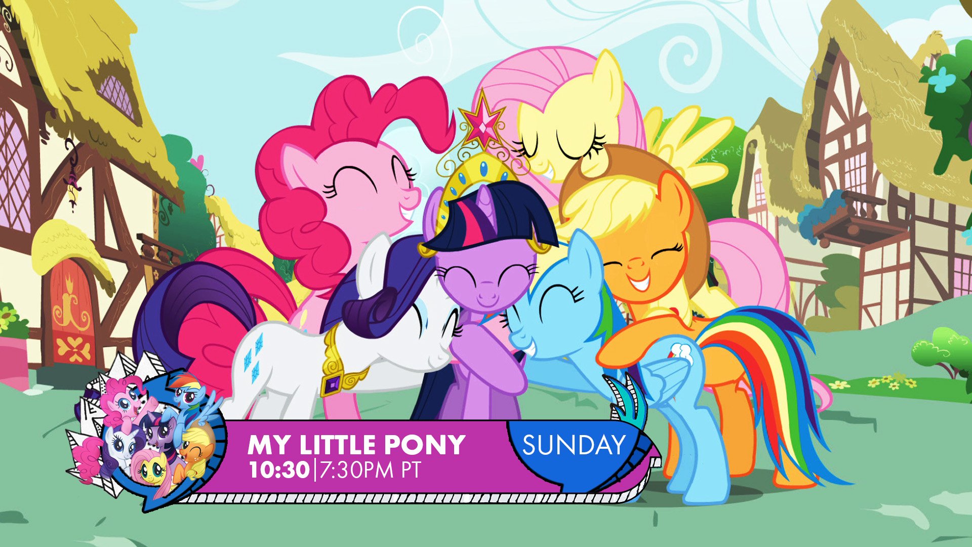
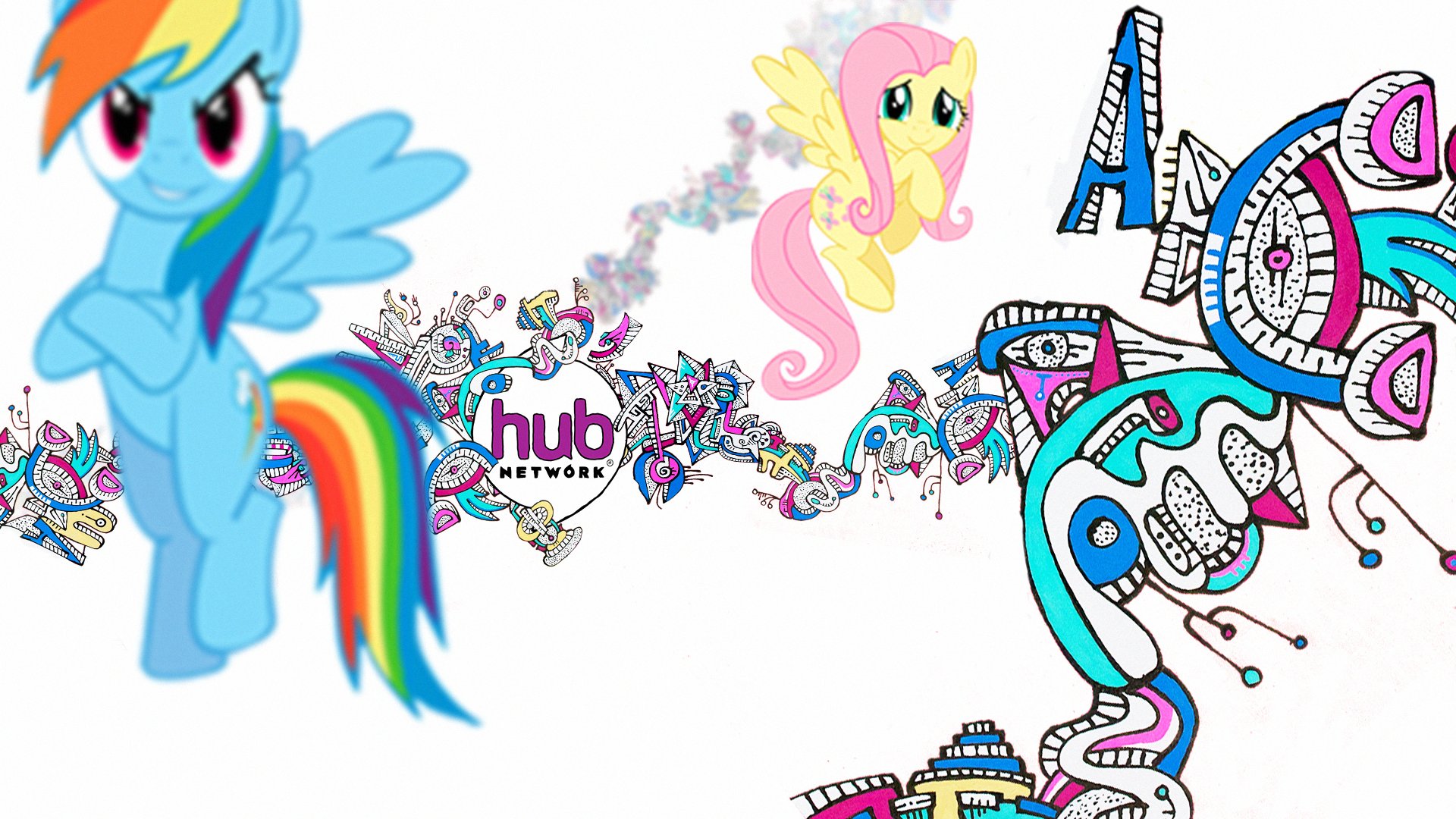
Girls' Programming: Moving beyond typical "girly" stereotypes, I created a hand-drawn doodle style with bold linework and a modern color palette. This approach brings sophisticated abstraction to content like My Little Pony, elevating the visual treatment while maintaining its appeal.
The unified identity system features a consistent logo treatment and circular framing device that creates instant channel recognition while allowing for creative flexibility. The system provides clear visual navigation between programming blocks while positioning Hub Network as a premium destination for diverse family entertainment.
Style Explorations


Rebrand Elements
logo page, lower 3rd, mortise….