Project:
Tennis Paradise
Role: Art Direction/Design.
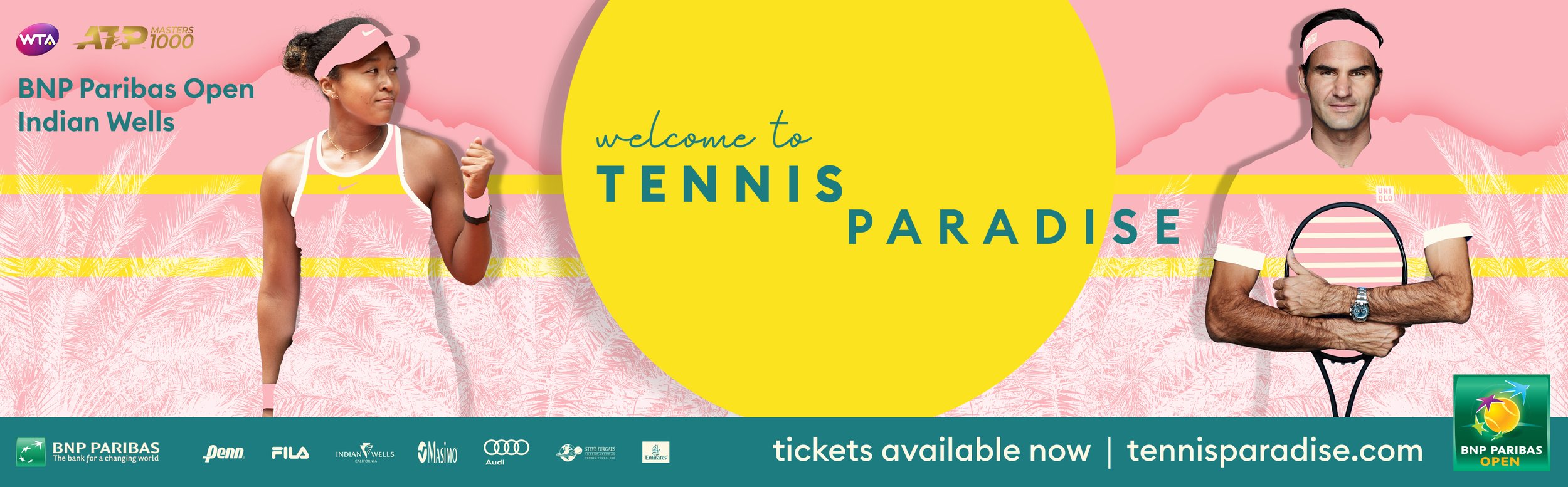
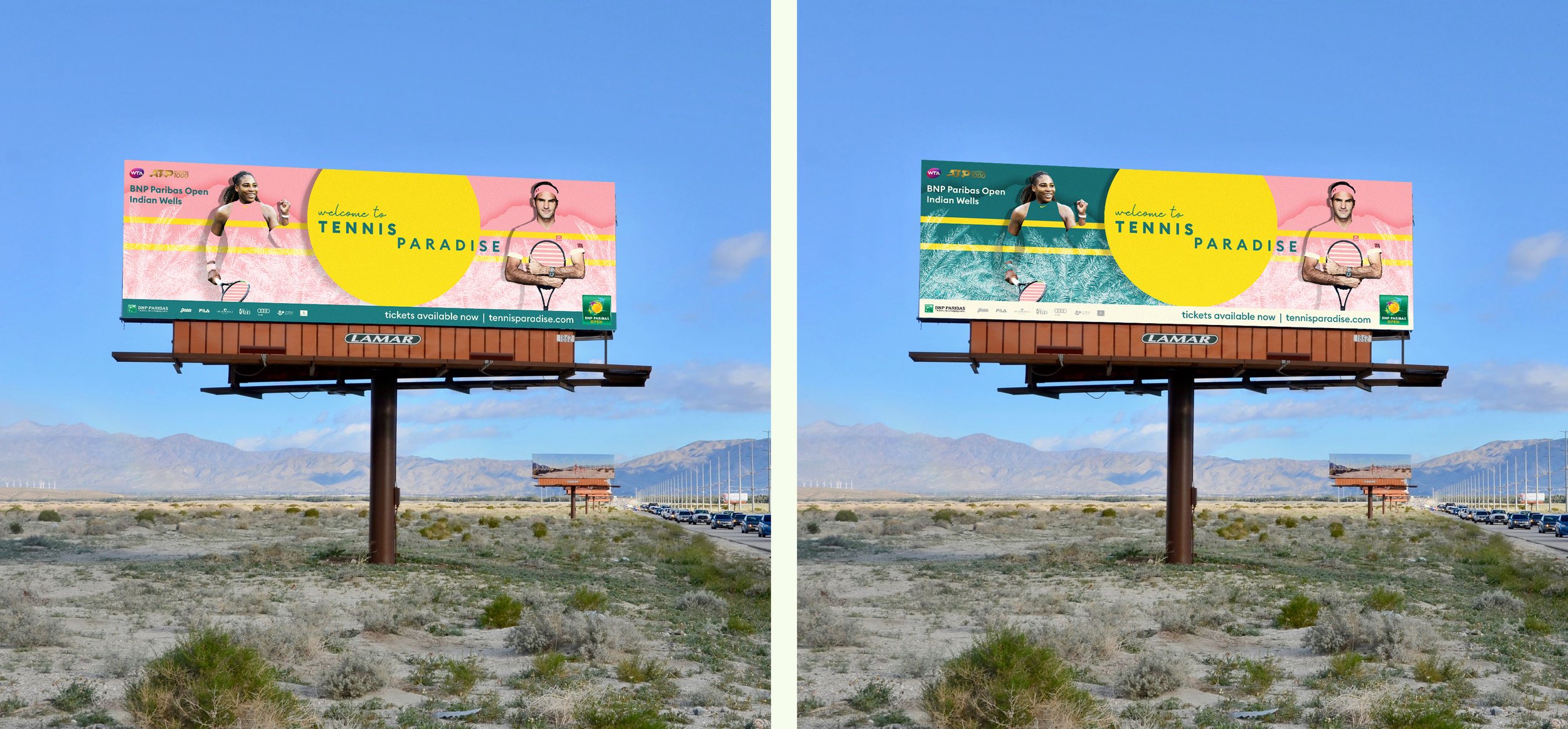
This comprehensive branding campaign for the BNP Paribas Open at Indian Wells—one of tennis's most prestigious tournaments outside the Grand Slams—embraces the unique character of its Palm Springs location while challenging traditional sports marketing conventions.
Inspired by Palm Springs' iconic retro aesthetic, the color palette serves both practical and conceptual purposes. The vibrant yellow captures the desert's sun-drenched landscape, while the distinctive coral pink deliberately counters the masculine-coded visual language typically associated with sporting events. This intentional color choice creates a more inclusive and contemporary visual identity that stands apart from conventional tournament branding.
The design approach honors Palm Springs' modernist architectural heritage through clean lines and geometric forms, creating a sophisticated visual system that feels both timeless and distinctly of its place. The integration of palm silhouettes as subtle textural elements further reinforces the location's identity without resorting to clichéd imagery.
By balancing high-fashion minimalism with strategic references to the tournament's desert setting, the campaign positions this world-class event as more than just elite tennis—it becomes a celebration of place, culture, and style. The resulting identity successfully communicates the unique "Tennis Paradise" experience that makes this tournament one of the most beloved on the professional circuit, attracting both dedicated fans and those drawn to its distinctive atmosphere.